- 1 0 T H Y E A R C A N A R T C O N T E S T -
P A B S T B L U E R I B B O N
|
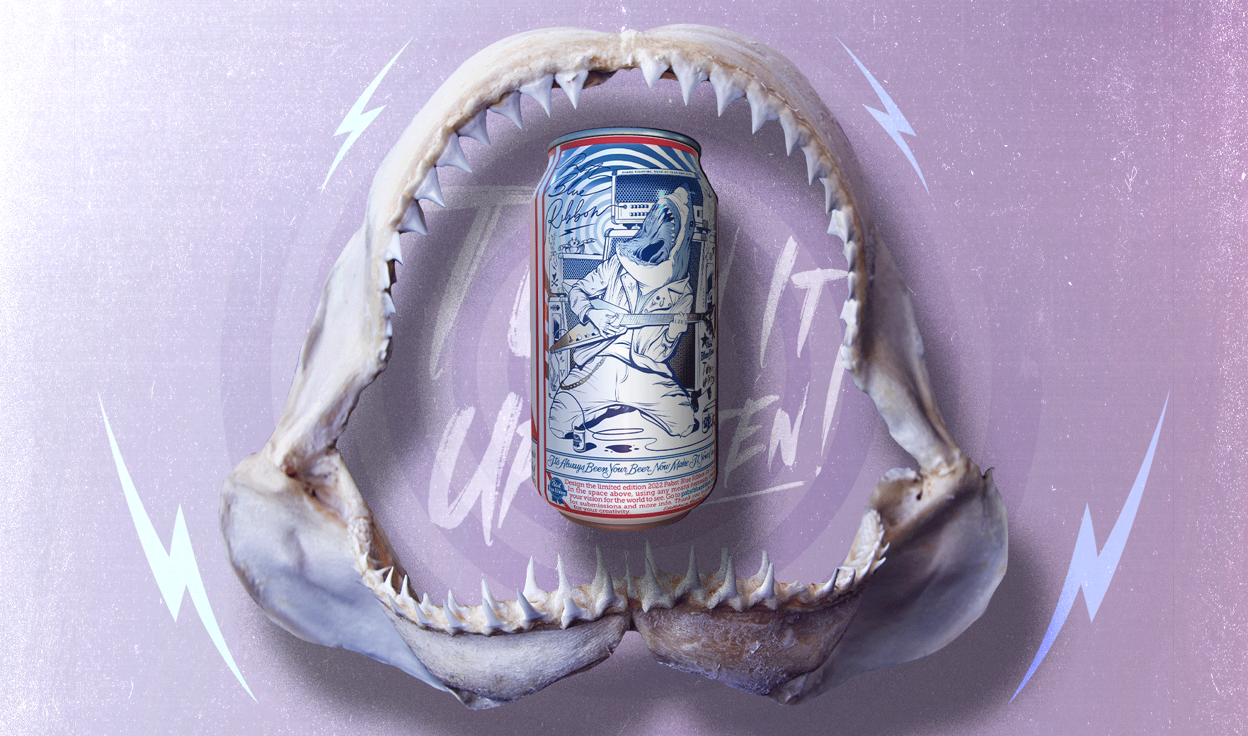
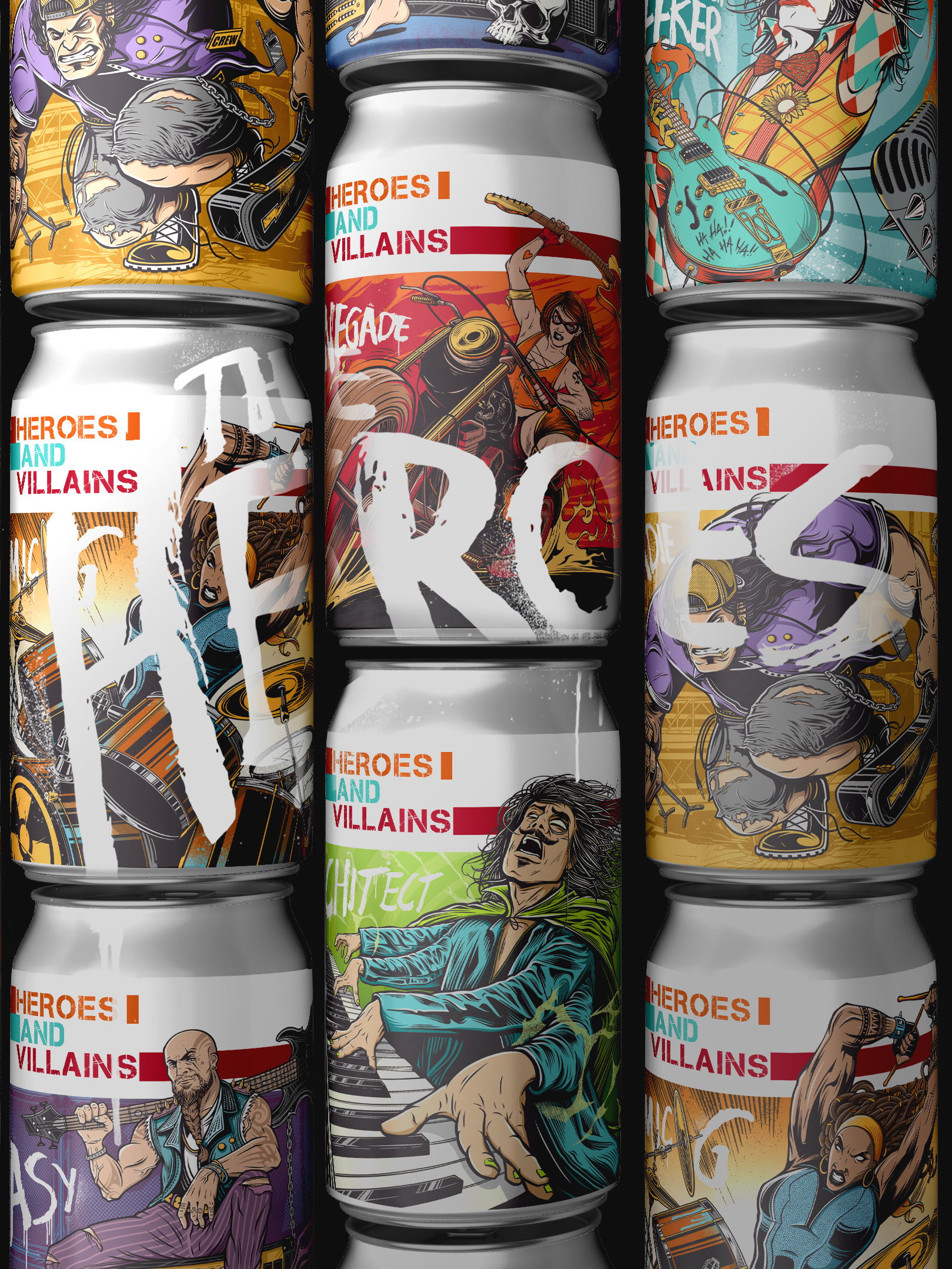
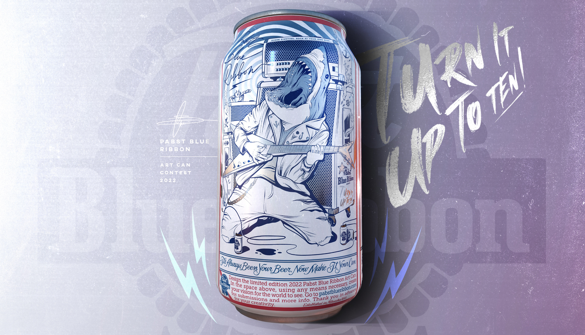
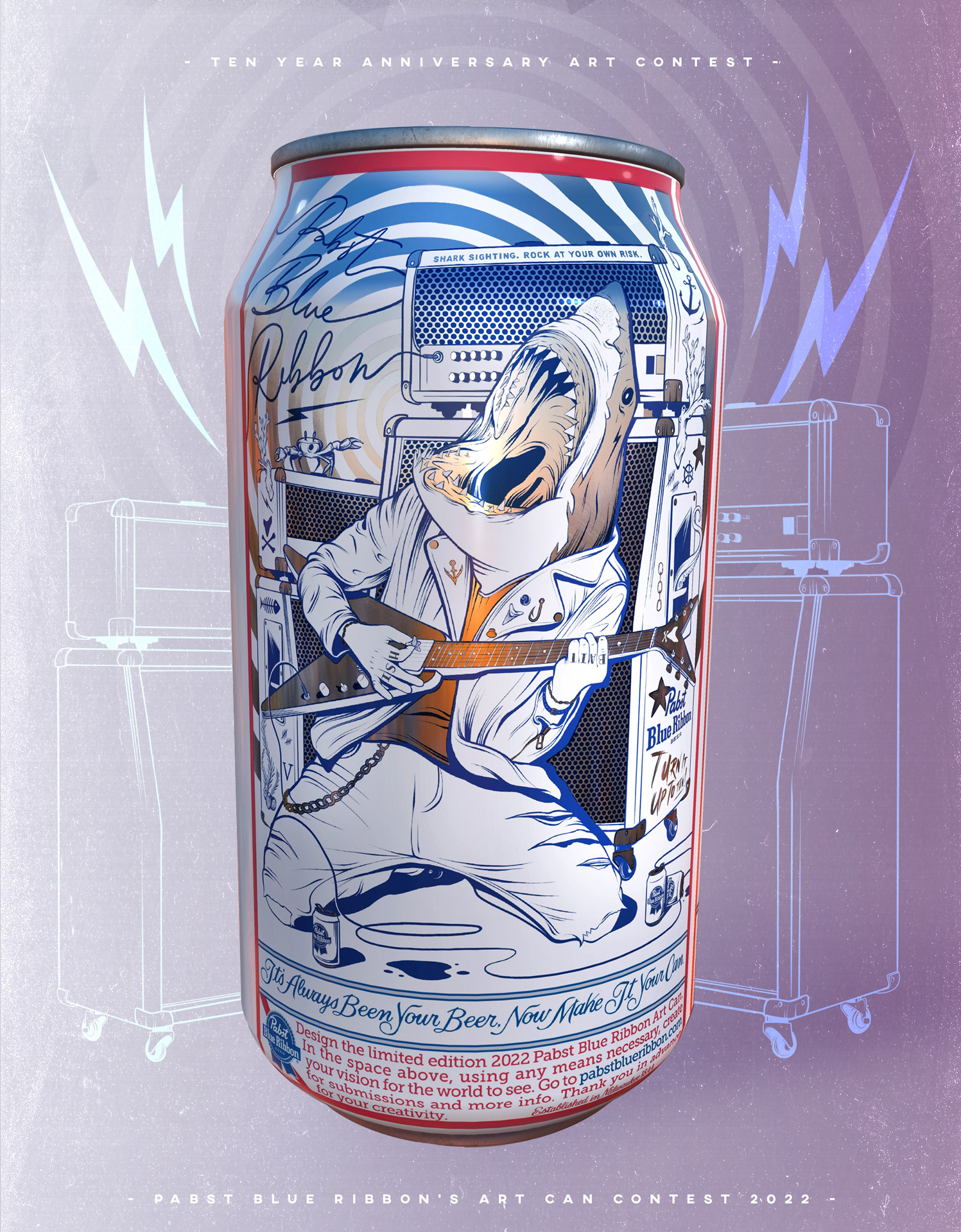
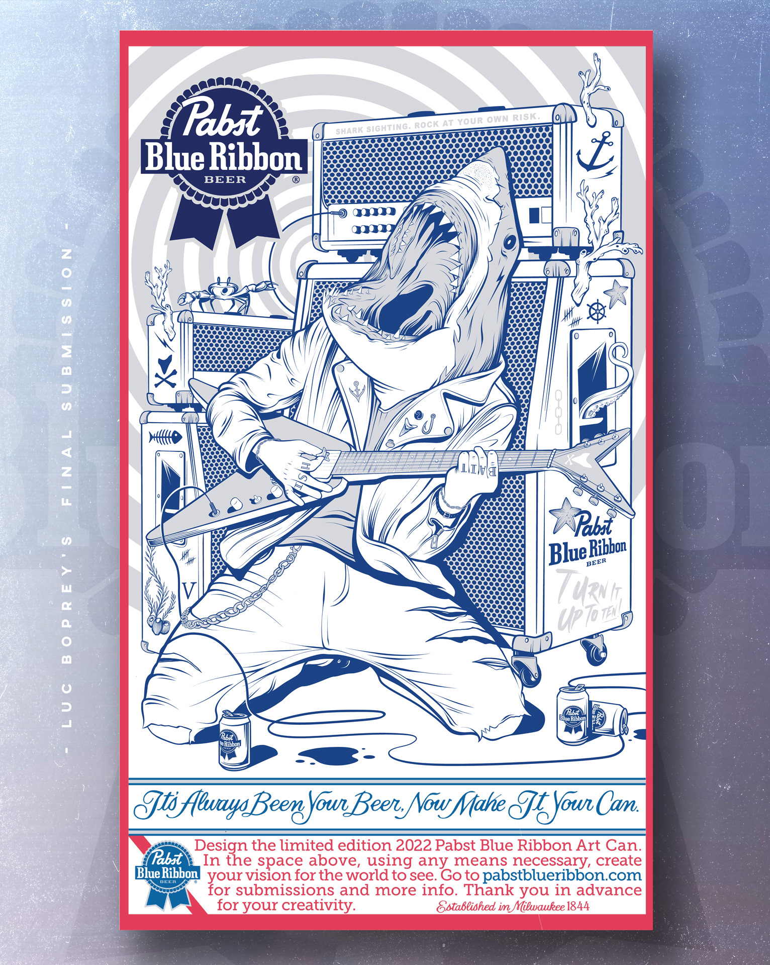
PBR’s annual can art contest has reached it tenth year and its bigger than ever. It has been opened for the first time to a worldwide audience allowing anyone to enter. With the limitation of only being able to use two colours (and the silver of the can) this is my concept “TURN IT UP TO TEN!”,which plays with the contests anniversary year.
P A B S T B L U E R I B B O N
T W O T O N E R U L E S
|
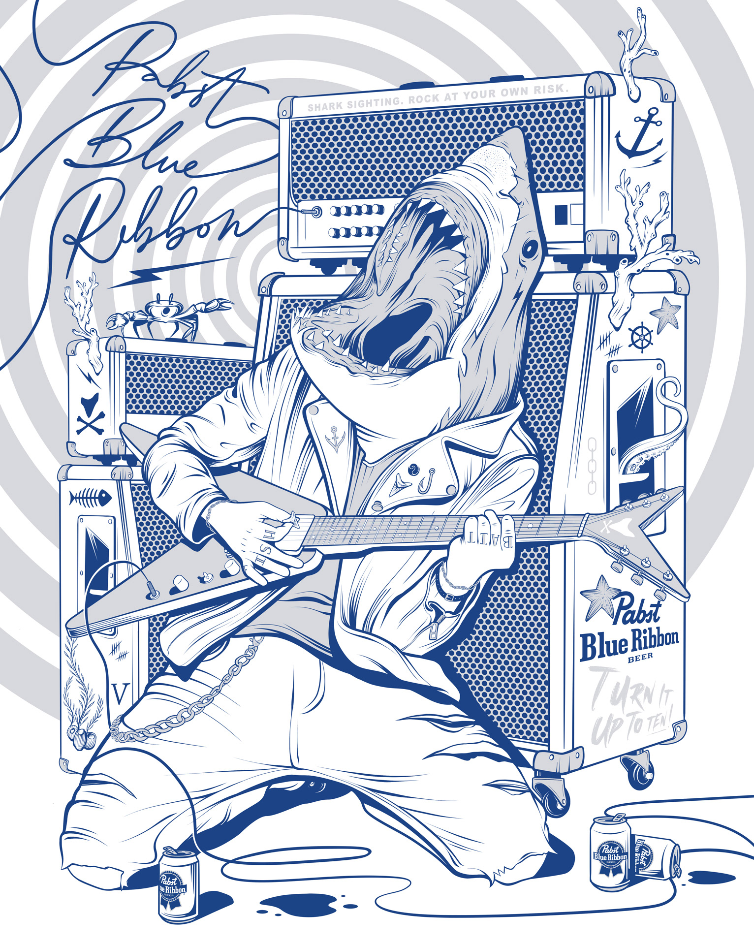
The main challenge was to illustrate PBR'S eccentric personality while only being able to use white and the brands classic PBR blue. The exception being that you are able to have a substrate layer revealing the cans natural silver. If used correctly, I knew this would be the designs main vocal factor that would draw the most attention and bring contrast to the design.
- P A B S T B L U E R I B B O N -
F I N A L S U B M I S S I O N
|
The main idea behind my design was to draw attention to the loudness of the brand and its celebration being that it is its 10th year holding the contest. I had wanted to depict this illustration for a while and it perfectly fit for the brand and its anniversary. "Turn it up to ten!" was a mixture of a Spinal Tap reference, mixed with my own love for the absurd. It lent itself to many intricate details that came from its mixture of nautical imagery and a rock and roll persona. From coral growing from the amps, to "fish bait" tattooed across his knuckles, I felt that the cross over was achieved.